Repositioning and redesigning a Swedish classic
In 2011 we redesigned the classic Swedish beer brand Falcon, and in 2016 it was time to revisit the brewery once more. Five years is a long time, leading to an oversaturated market with mainstream beer brands struggling for relevance. So the challenge was simple – how do we reinstate Falcon as a contemporary and culturally relevant icon?
We started out by establishing a new positioning territory that takes great pride in being mainstream. Falcon is a beer for everyone, with the confidence of having 120 years of real history, brewed in the same town that was once chosen for its pure, clean water over a century ago. By the people of Falkenberg, for people who like to drink beer together.
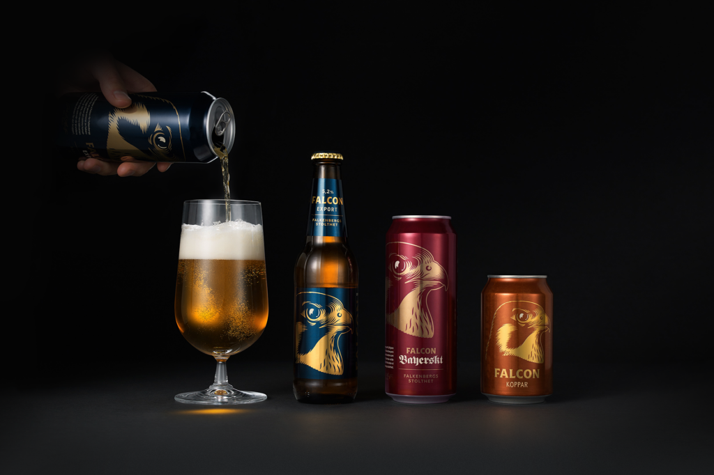
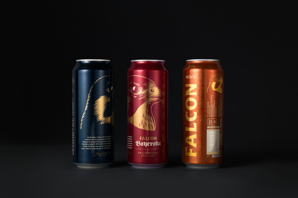
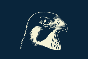
Part of the process was to reduce the brand down to its core, where the iconic falcon would carry the communication it represents – freedom, purity and strength. The new Falcon beer has simply evolved into what it always was, deep down, without the excess of iterative layers and confusing family tree of line extensions. It’s Falcon, pure and simple.
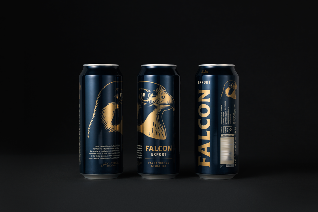
The wordmark was redrawn to give it a sense of craftsmanship without losing recognition.
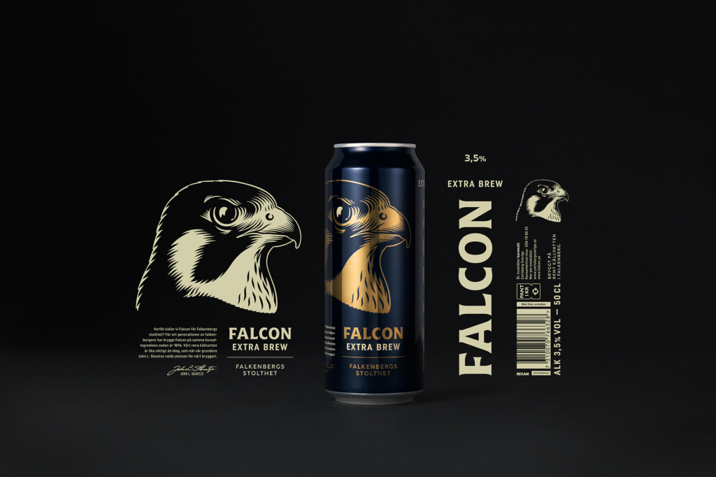
The typography and colour were consolidated and a grid system was introduced for the first time to support the communication across hundreds of touch points.