A visual and verbal re-branding into the future of real estate
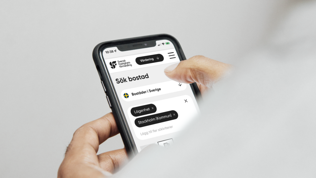
After 85 years of being at the forefront of the real estate market, it was time for Svensk Fastighetsförmedling to make progress and update its brand. This player is used to taking the lead, thinking differently, and going their own way. They came to Grow looking to evolve their innovative and modern brand associations based on their clients’ growing requests for services, inspiration, and future offerings within sustainable living.
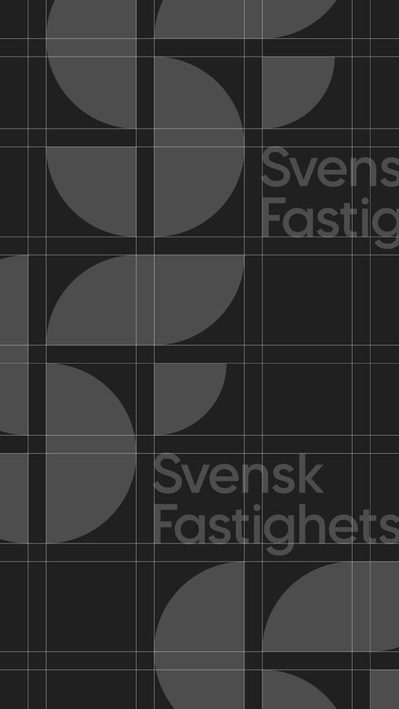
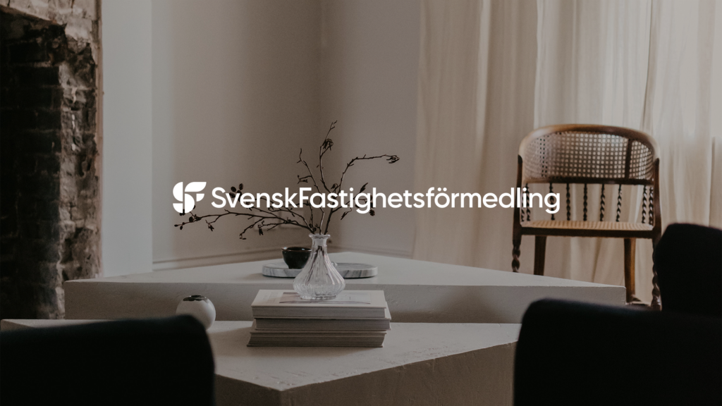
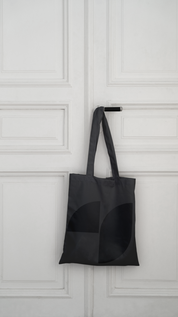
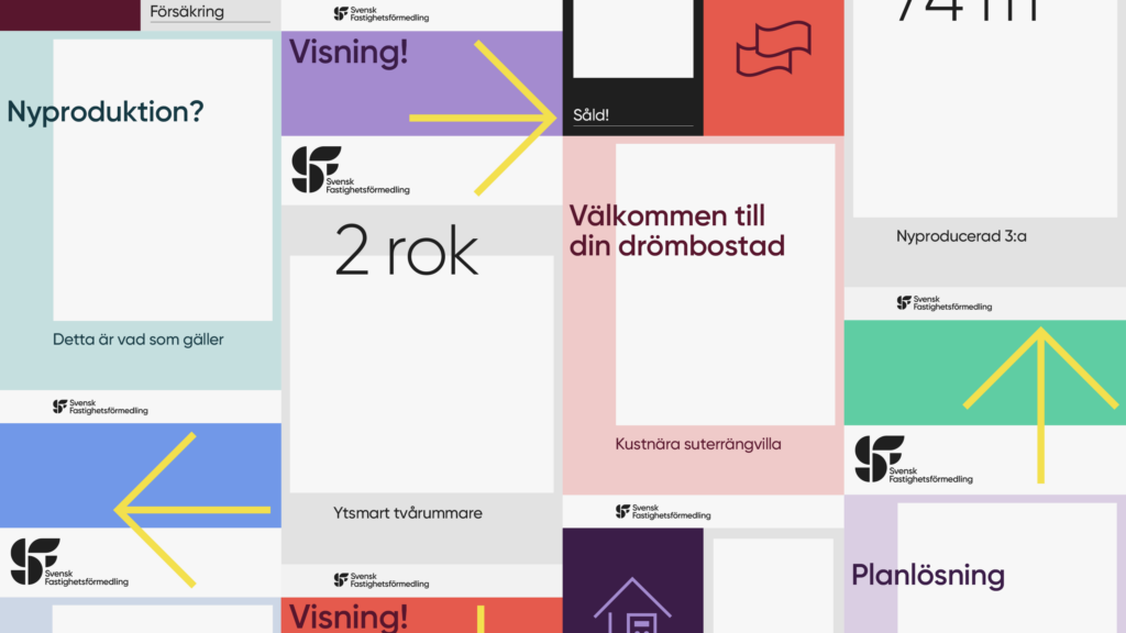
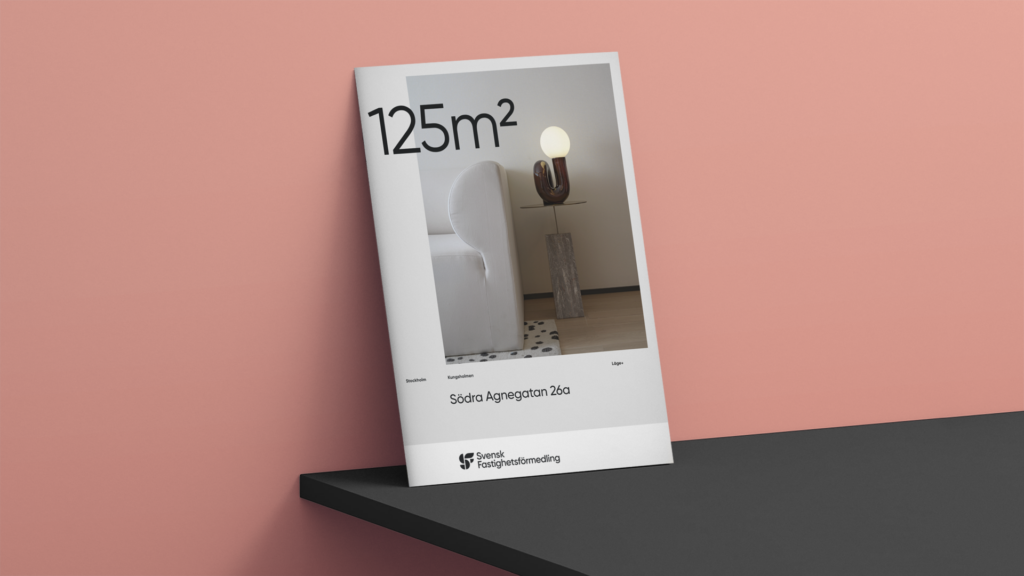
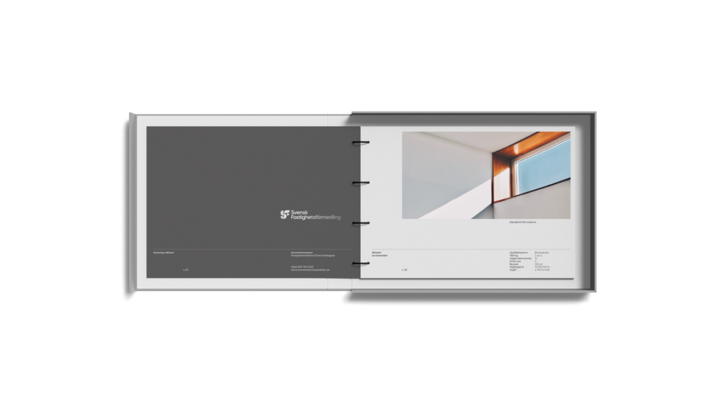
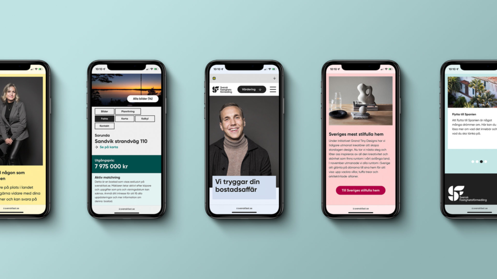
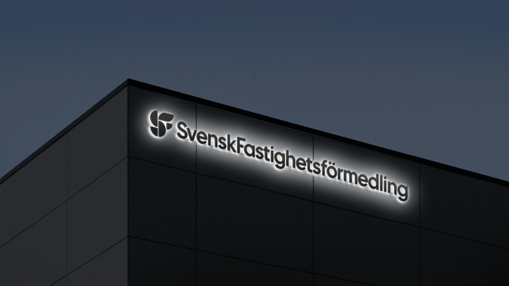
Grow brought the new brand to life verbally and visually. Influenced by their founding days in the 1920s and 1930s, we created a timeless logo with a graphic clarity inspired by modernism and functionalism characterised by this time period. The new identity – with its functionality and asymmetrical elasticity – is just as relevant today as it was 100 years ago.
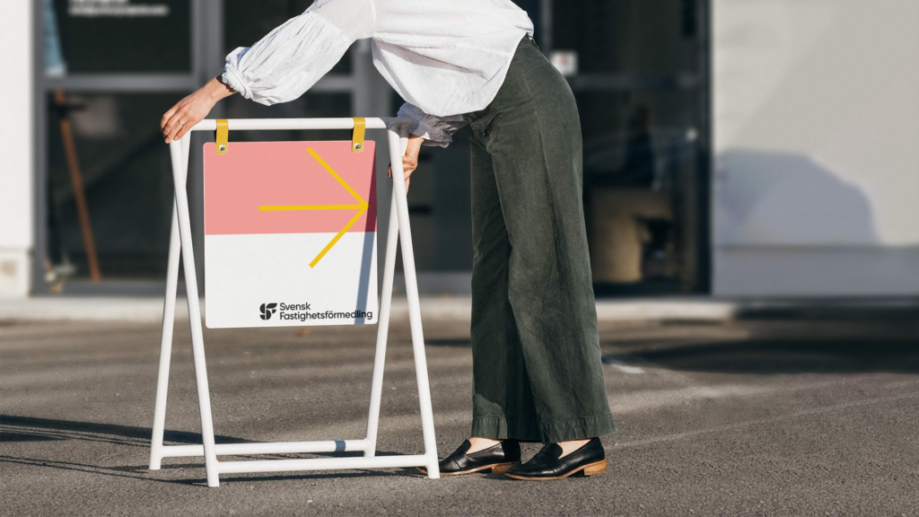
As a leader in an ever-changing market, the new identity for Svensk Fastighetsförmedling also needed to reflect the updated value proposition which Grow implemented through a new brand strategy, coming across as an influential, modern and innovative brand.
—
Top image by photographer Jonas Ingerstedt