Coming together for a future of possibilities
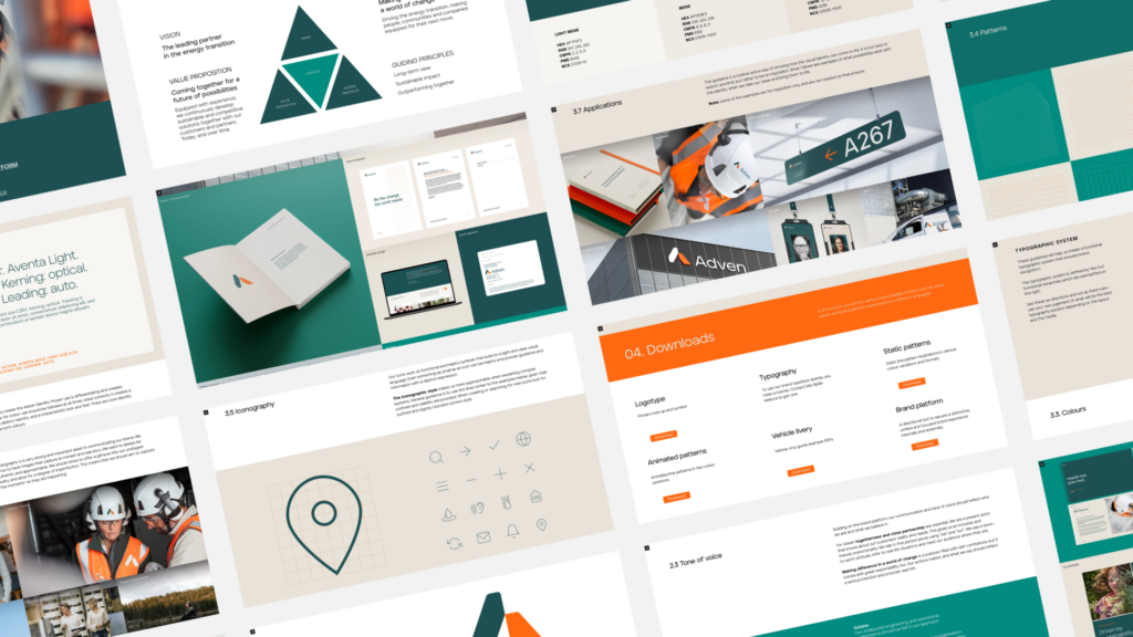
Being in the business of energy and industrial water, makes Adven one of the most important actors when it comes to the energy transition.Due to the merger between Adven and Värmevärden in 2020, the need for an integration of the two companies was a fact, and Grow was given the opportunity to define the Brand Strategy, Architecture and Identity for the company going forward.
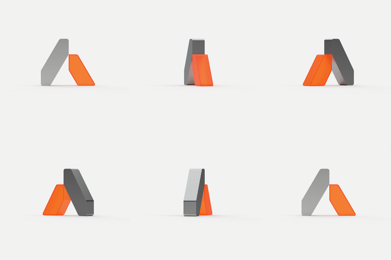
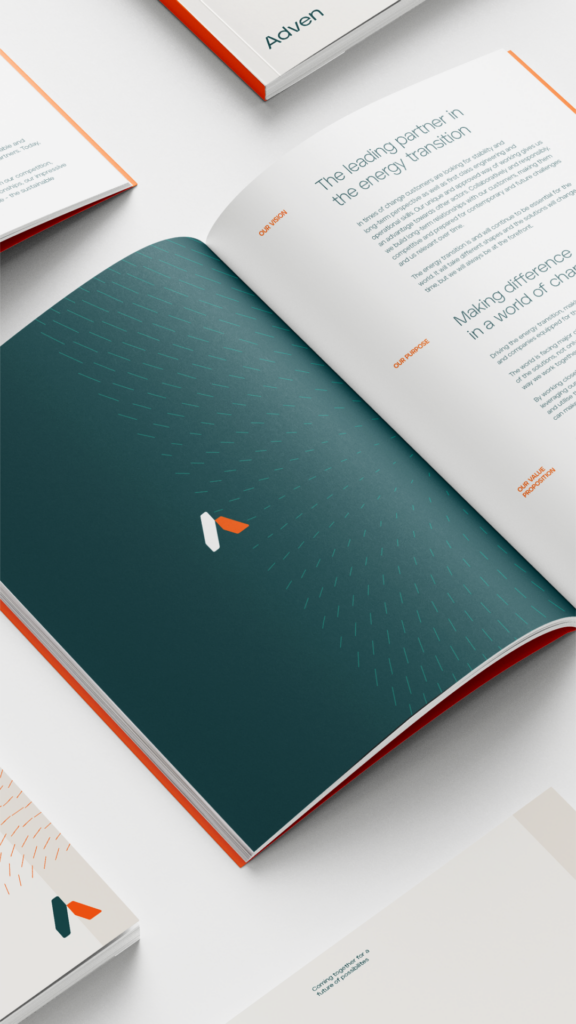
The local heart and global mindset are important ingredients in Adven’s way forward. But it is Adven’s dedication to customer relationships that truly distinguishes them from competitors. It’s committed long-term partnerships that will lead to sustainable impact, crucial for all of us. When designing the Adven logo, the stylized A was chosen as the primary symbol, built by two paths crossing and two pillars supporting each other, representing coming together and strong partnerships.
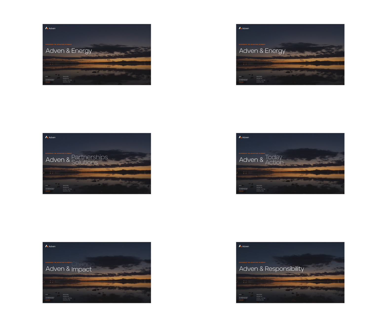
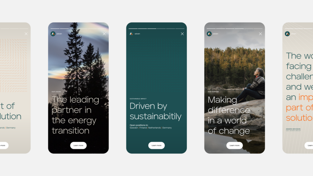
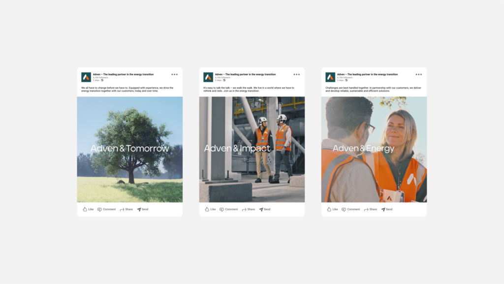
The partnerships are an important ingredient in the communication as such. “Adven &” was developed to be the flexible long-term concept that mirrors Adven’s view on how to make a real difference: By coming together for a future of possibilities.


 Indy Beauty